
It's been two weeks since the beta opened, and two of the greyed out items in the menu aren't greyed out anymore. Clutches and the Calendar are both in the beta now, the UI has been refreshed and there are also a handful of things you all asked for.
A lot of this post is about the Calendar, because it isn't a straight copy of the old one. It was rebuilt from scratch with a bunch of new features.
A New Look
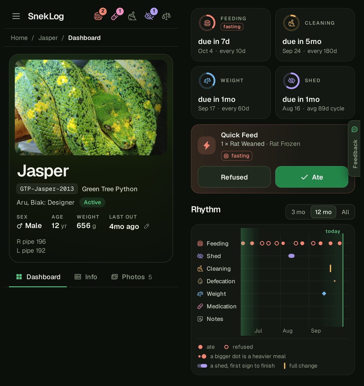
If you've been in the beta this week, you've probably noticed the whole app looks different. The new look went out this morning (October 8th), and it covers every screen.
The idea is a dark room with the enclosures lit up. Everything around the edges is a quiet green-black, so the only strong colors on the screen are your animals' photos and one color for each kind of care. The UI shown in previous posts was meant to be a 1:1 rebuild of the old app to get functionality in place, whereas this UI is a complete refresh to be hopefully user-friendly while also having a bit of artistic flair.
There's one font everywhere now. Names are set big and bold like the nameplate on the front of a tank, and record IDs like "BP-Donut-2017" are in a typewriter-style font, so they read like the label on a specimen jar.
Each kind of care has its own color, and it keeps that color everywhere it shows up. Feeding is coral, cleaning is amber, weight is sky blue, shed is violet and meds are pink. It's the same on the top bar, the status icons, the dials and the marks on the charts, so after a day or two you stop reading the labels and just go by color. Overdue doesn't turn things red anymore either, but more on that in the Light theme part.
It's also built around how most of us actually log: in the evening, on a phone, usually with one hand because the other one is busy. The buttons are bigger, the main action sits low on the screen where your thumb is (that's the floating + button), and nothing important hides behind hovering your mouse over something.
The Dashboard
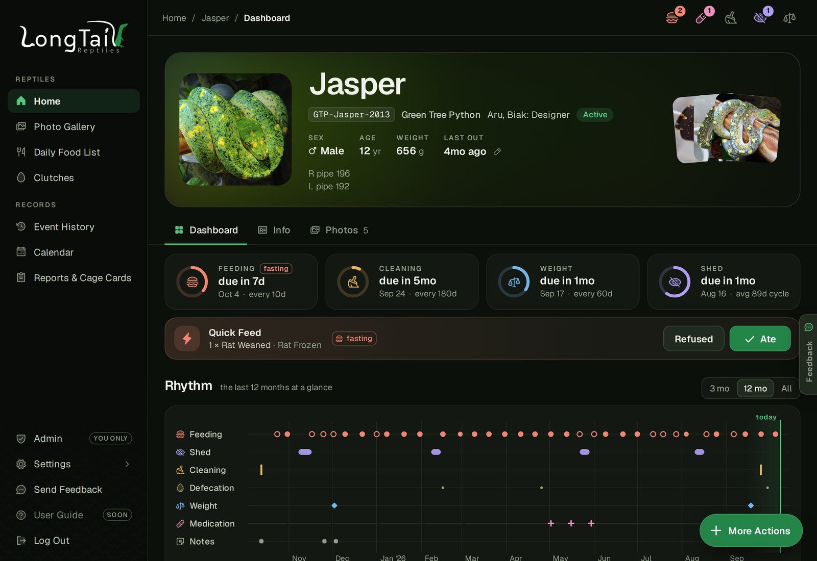
Where it shows the most is each animal's dashboard. From the top:
- The photo, with a strip of its other photos beside it.
- Care dials. One ring for each cycle (feeding, cleaning, weight, shed, and any medication course that's running) that fills up toward the next due date, with "due in 4d" or "9d overdue" in that care's color.
- Quick Feed. The usual meal, Ate or Refused, no form.
- Rhythm. More on that below, because it's my favorite.
- Growth. Weight over time, and what each meal weighs against the animal.
- History. Everything logged on one timeline, with buttons to filter it.
Rhythm
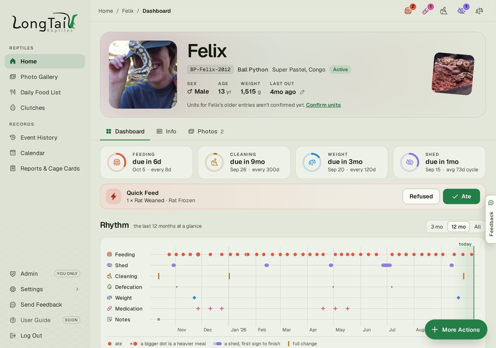
Rhythm came out of the redesign, and it's quickly become the first thing I look at. It's everything that happened to an animal laid out on one timeline, a row for each kind of care, with "today" at the right edge.
Each kind of care gets its own mark. A feeding is a dot, and the heavier the meal, the bigger the dot. A refused meal is a hollow dot, and a meal of more than one food is still one dot, sized by all of it. A shed is a capsule that runs from the first sign to when it finished, lighter while it's in pre-shed, solid once it's in shed, and hollow if it was a bad shed. A cleaning is a tick, and a full substrate change is a tall one. Weigh-ins are diamonds (a length is a hollow one), a dose is a cross, a pairing is a ring, and anything else is a little square. Any kind of care with something logged gets a row, your own custom ones included.
It opens on the last 12 months, and you can switch to 3 months or All. An animal with nothing logged in the last year opens on All instead, and one that's left your collection is drawn up to its last entry instead of today. Hover over or tap any mark to see what it was and when. On a phone, the strip scrolls sideways so each month stays readable, starting on today.
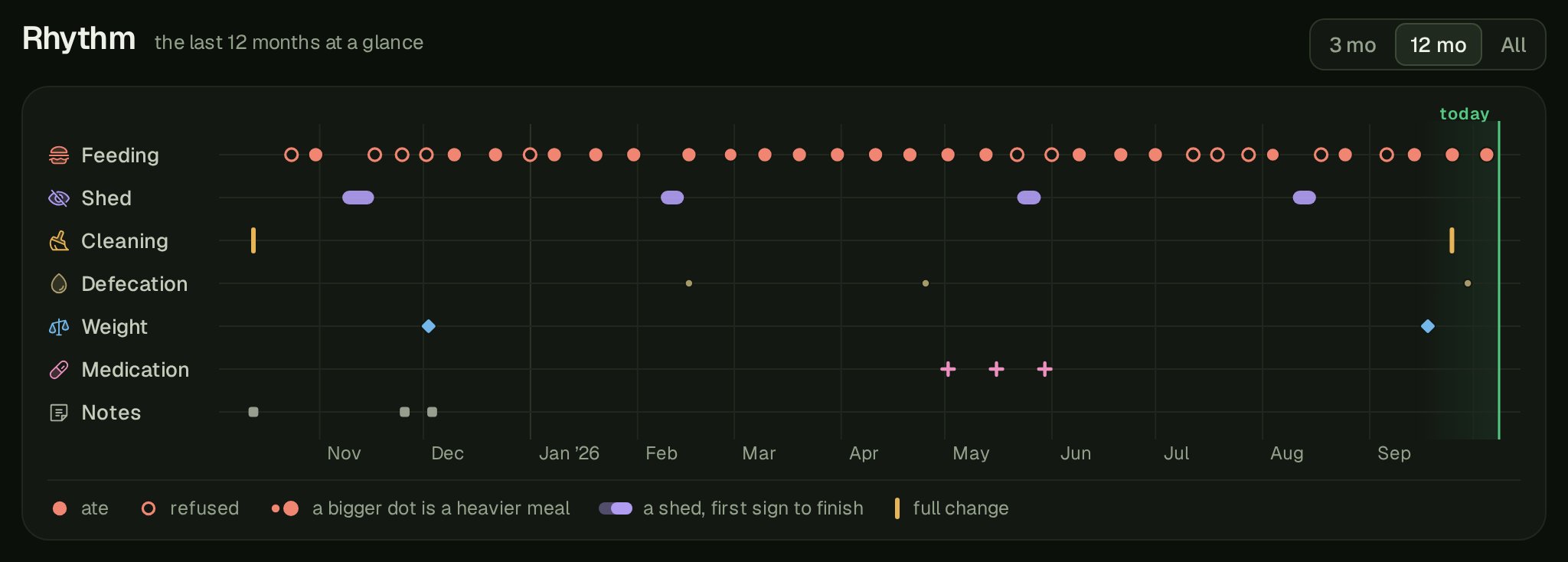
Shown above is Jasper's last year. We try to feed him about every ten days (he's a picky eater sometimes and refuses a fair bit), and you can see his sheds come round like clockwork, four of them almost exactly three months apart. The three pink crosses in May are a round of Panacur, two weeks apart, and sure enough there's a refusal sitting in the middle of that course too. The rhythm is pretty cool here because it allows you to visualize the entire history and you might start to see patterns in the data.
None of that is new, it was all in his history already. But in a list, a hunger strike is just a lot of rows that say "Refused". On the strip you see it at a glance, and the same goes for sheds spacing out as an animal grows up, or how long it's been since the last full clean.
The Light Theme Is Back
Back in 2020 I finally added a Light theme to the old app, and it's back in the new one. You'll find it under Settings › Preferences › Theme, with Dark, Light, or matching whatever your device is set to. Matching your device is the default for new accounts, and everyone else keeps what they had.
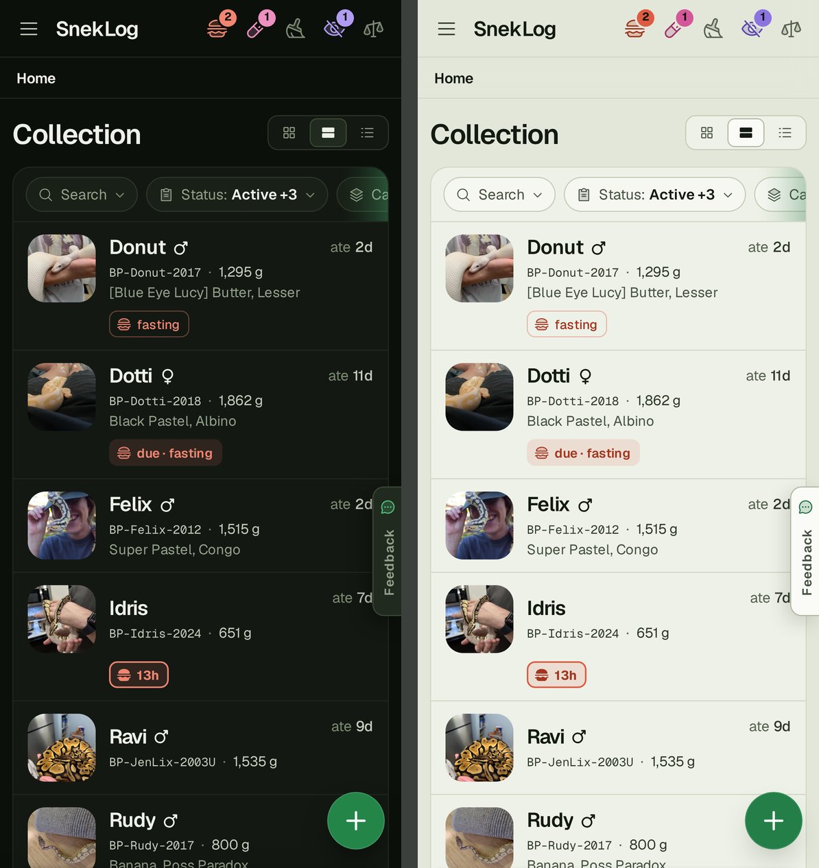
I'll be honest, I don't know how many of you actually use it, so if you do, I'd love some feedback on it. The one thing that stays dark on purpose is the photo viewer and editor, because photos just look better on a dark background.
The Calendar
The old Calendar went in back in 2021, and when I wrote about it I admitted it was "a little bit on the basic side". It showed what was due and not much else, and on a phone you only got a list. I had big plans for it at the time that never happened, so this time around I started over.
You'll find it under Records › Calendar.
What's On It
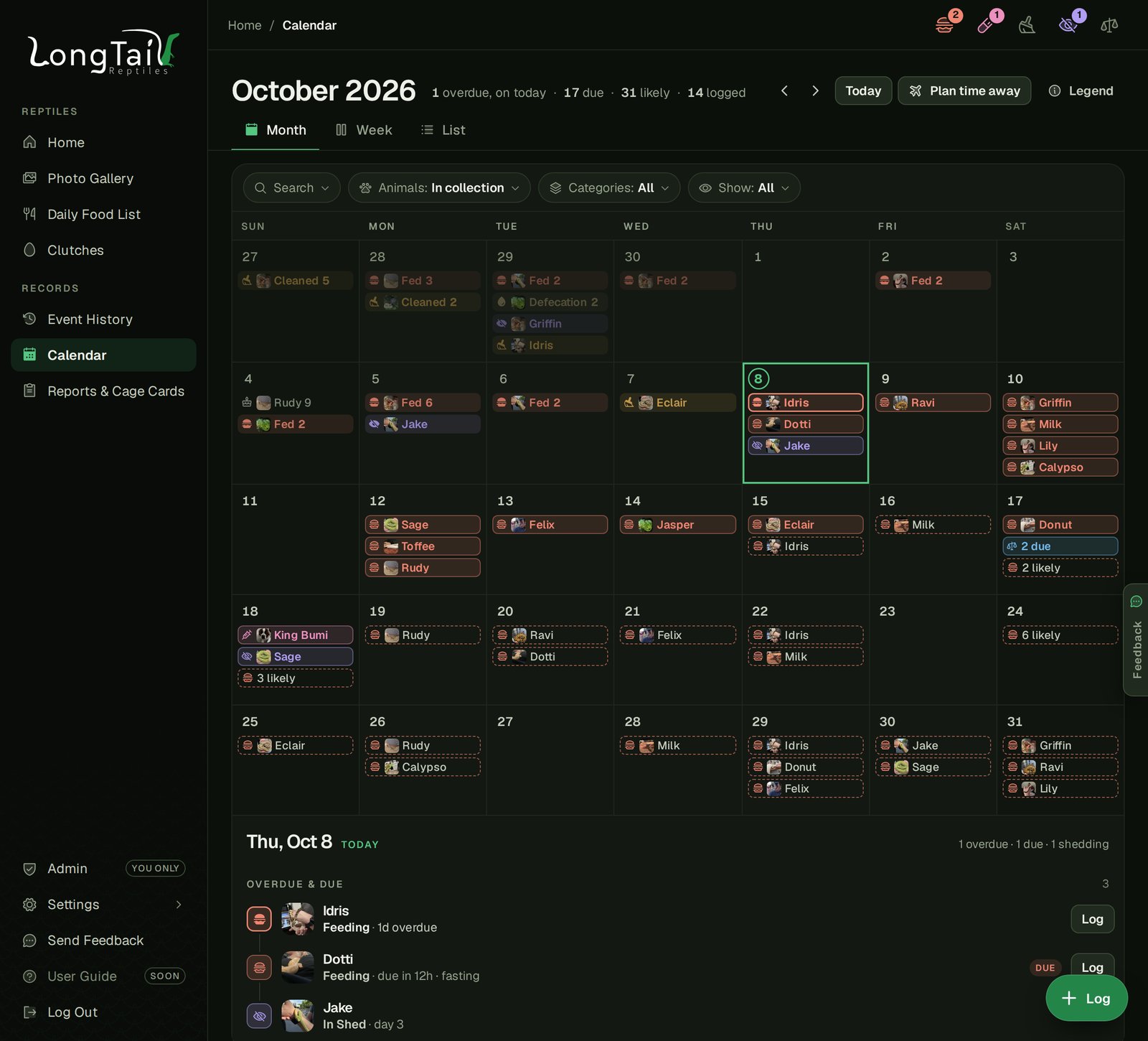
Everything lives on one calendar now:
- What you logged. Feedings, cleanings, sheds, weigh-ins, meds and the rest, filled in with a color for each kind of care, the same colors the rest of the app uses.
- What's due. Outlined, so you can tell it apart from what's already done. Anything overdue sits on today, so it doesn't get lost three weeks back.
- What's likely. This is the new one. The dashed borders are SnekLog's guess at when each animal's next feedings will land, assuming it gets fed on time. So you can look a week or two ahead and see that next Wednesday is going to be a big feeding day before it sneaks up on you.
- Clutches and birthdays. A clutch's due date shows up, and so do birthdays.
When a day gets busy it bunches things up instead of drowning you. Six feedings logged on the same day show up as one "Fed 6" box rather than a wall of names, and a pile of overdue weigh-ins reads "13 overdue". Click any day and the panel below lists everything on it, and clicking a row takes you to that animal or that event.
The filters work like they do everywhere else in the app. Search, pick your animals, pick which kinds of care you want to see, or choose between logged, due and likely. Animals that have been sold or passed away are left off by default, but you can bring their history back in if you want to look back.
On Your Phone
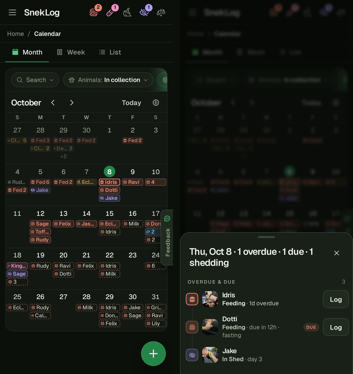
The phone version is the part I'm happiest with. The old app gave you a list on a phone and that was it. This time I built it like the Calendar app on an iPhone. The month fills the whole screen, each day has little icons with names on them (and a "+3" when there's more than fits), and you swipe to change months. Tap a day and a sheet slides up with everything on it.
Week and List
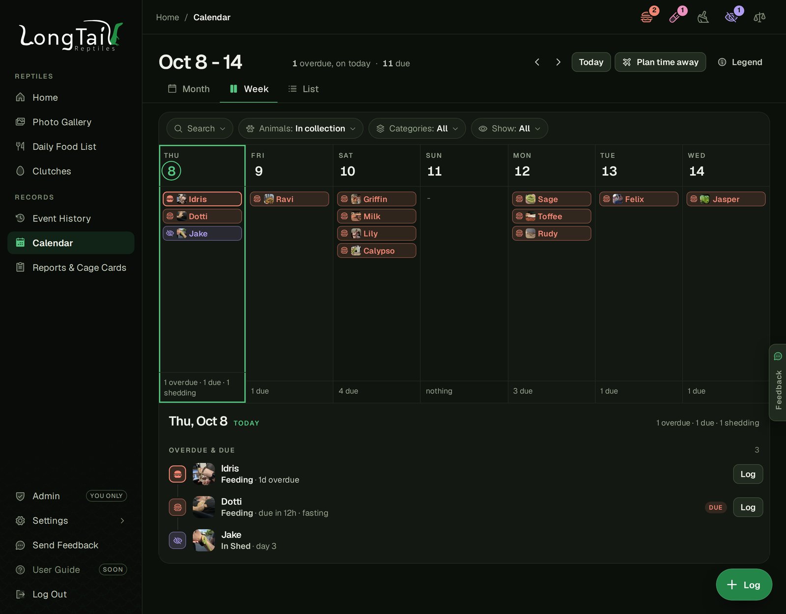
The Week view on a computer is a proper seven-day board. It starts on whatever day you're looking at instead of Sunday, so from today it's today and the six days after. That's the view I find myself using the most, since "what's coming this week" is usually the question I'm asking.
The List view is everything in one long scroll, one day after another, and it loads more as you scroll up or down.
Logging From the Calendar
You can log right from the Calendar now. The "+" button in the corner offers Quick Feed, your cleaning types and a weigh-in for the day you're looking at, and the animals that are due that day are already ticked for you. It uses the same check list as Select & Log, so every animal still gets its Ate, Refused or Skip. Pick a day in the past and the entries are dated that day, which is handy for catching up after a busy weekend.
There's also a quiet "Log" button on anything that's due, and "Log 11" on a bunch of overdue feedings to do them all at once. A medication that's due opens the medication form instead, since a dose needs more than one tap. Whatever you log, there's an Undo afterwards.
Plan Time Away
This one is really my spouse's idea of what a calendar is for, and honestly it might be my favorite thing in the whole update.
Hit "Plan time away", pick the days you'll be gone, and SnekLog works out what comes due while you're away. Then, for each animal, it figures out whether it's better to feed early before you leave or feed when you're back.
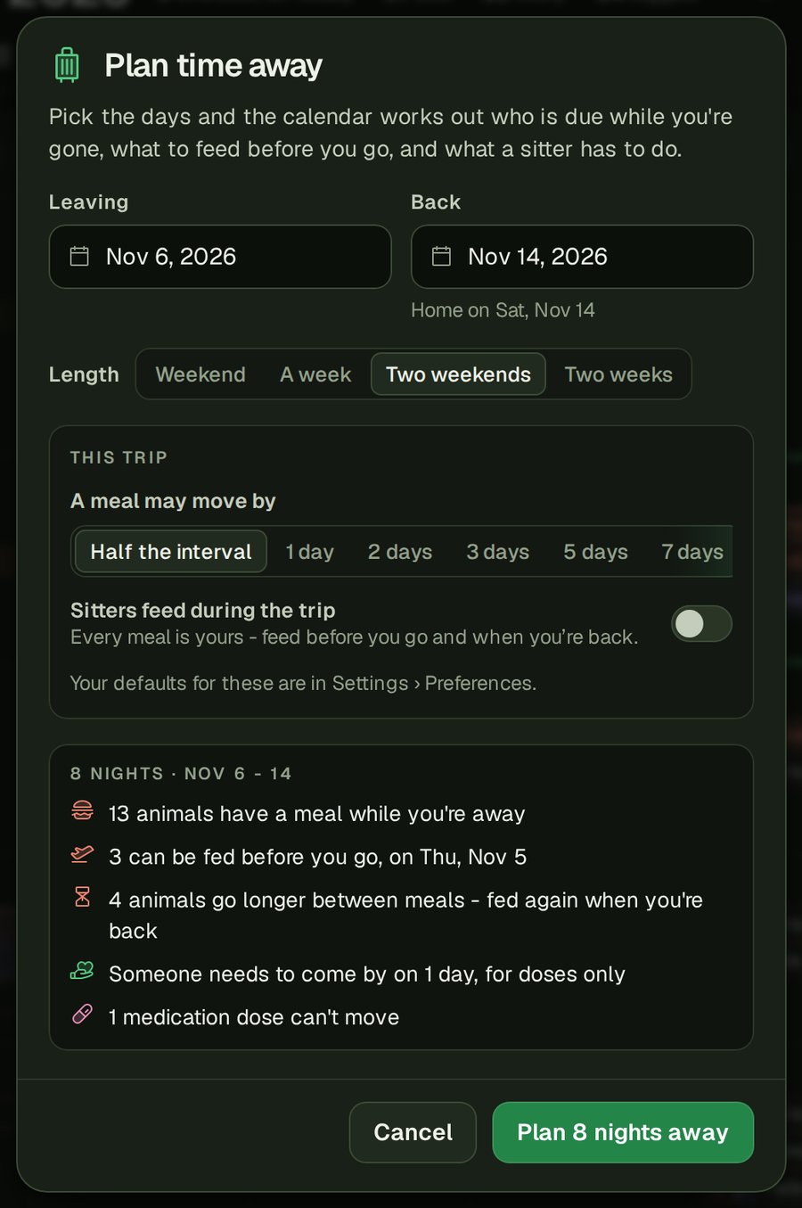
How far a meal is allowed to move is up to you. By default it's less than half the animal's interval either way, so a snake that eats every 7 days can move up to 3 days. You can set your own default under Settings › Preferences ("Trip planner") or change it for just one trip.
The other setting is "Sitters feed during the trip", and it's off by default. My spouse and I will almost never ask a sitter to feed any of the snakes, so I didn't want the planner assuming we would. With it off, every meal is yours, and if an animal ends up going longer than usual between meals it tells you plainly ("9 days between meals instead of 6"). With the option turned on, a meal that can't wait goes on the sitter's list instead.
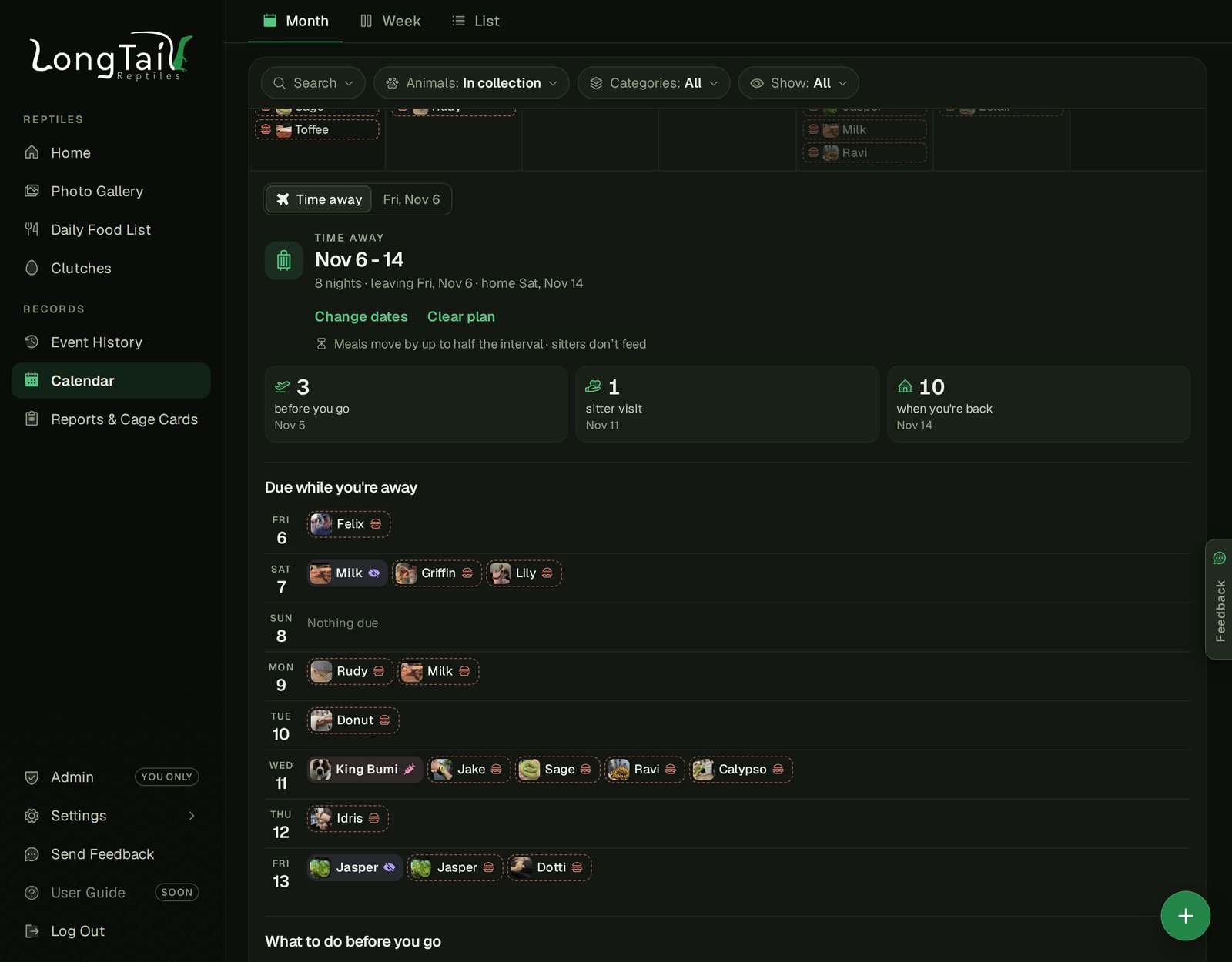
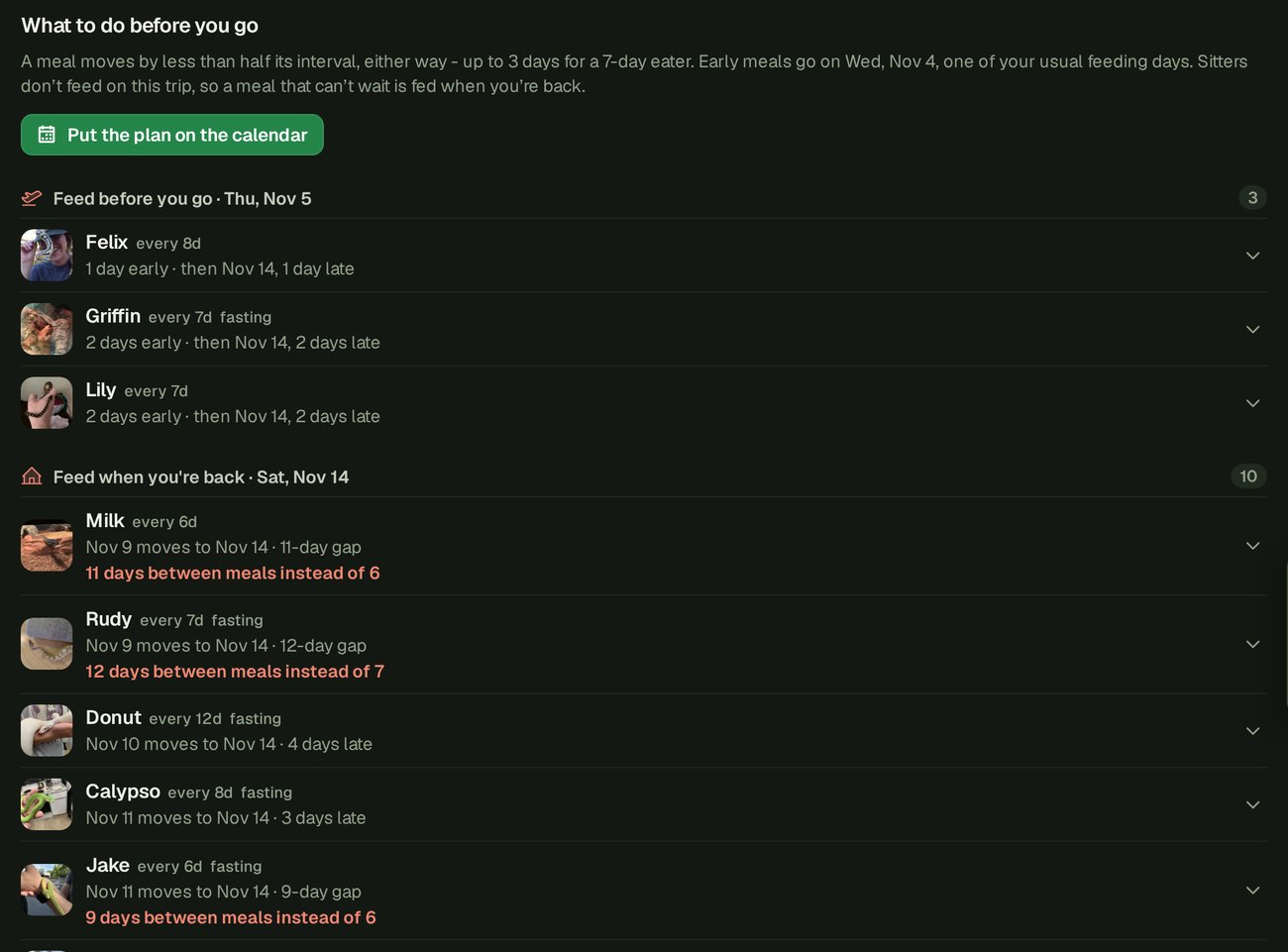
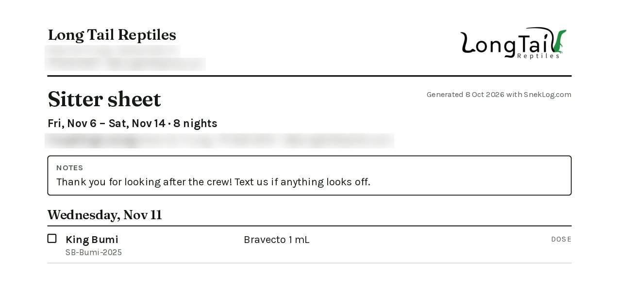
In my case, an 8 night trip in November means feeding 3 animals the day before we leave, feeding 10 more when we get back, and someone coming by one day to give King Bumi his meds. Nobody needs to touch the snakes.
The Sitter Sheet
Whatever does need to be done ends up on the sitter list, which you can copy as text, or now print as a sheet. You get a one-page PDF with your contact info at the top, a box for any notes you want to leave, and a checkbox for every task on every day so your sitter can tick things off as they go.
That's the Calendar. My spouse and I went back and forth on a clickable mock up of it before I wrote a line of the real thing, and I think it was worth it.
Clutches
Clutches are in the beta now too, under Reptiles › Clutches. Each clutch is a card with a ring showing how far along incubation is ("Day 34 of 58 · due in 24 days"), the parents, the egg counts, and the hatchlings that are already in your collection.
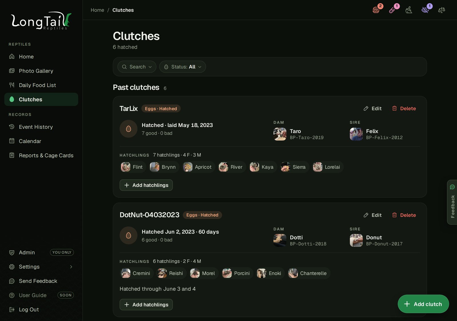
Hatchlings are matched up by their clutch ID, so if you've been tagging your babies with the clutch name, they'll just show up on the card.
A Quick Confession
Until recently, my TarLix clutch was sitting on "Day 1200-something of 60". It hatched in 2023 and I never got around to marking it hatched in the old app. So now there's a small "Hatched already?" note on any clutch that's still incubating but already has hatchlings in your collection, with a Mark Hatched button and a "Not yet" if you aren't ready. It never changes anything on its own.
Adding Hatchlings
When a clutch hatches, "Add hatchlings" lets you add the whole clutch in one go. Set how many males, females and unknowns hatched, and it names them the way a lot of us already do (the clutch name, a number and a sex letter, like "JesJas190728-03F"). Every name can be changed, you can put in hatch weights and lengths, and there's a box to mark the clutch hatched while you're at it. The housing, feeding and lineage details come from the mother, so you don't have to fill the same thing in five times.
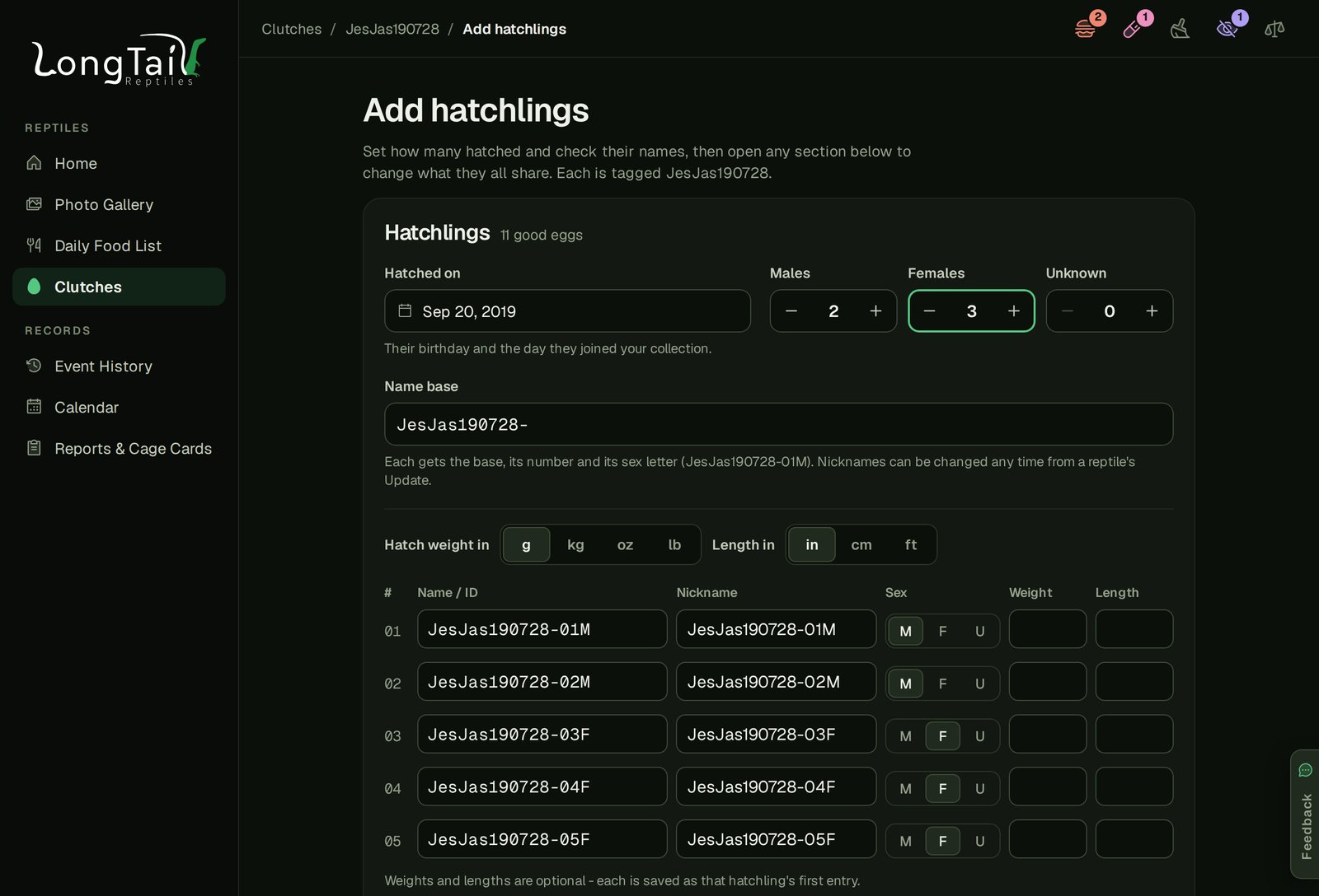
One more nice touch: when you set a clutch's lay date, SnekLog suggests a due date based on your own past clutches, from the same mother if she has a couple of hatched clutches, otherwise from the same species. You can always type your own.
Feeding More Than One Thing at Once
This was a beta tester's request and it was a good one. If an animal eats a rat and a hopper in one sitting, the feeding form now takes up to five foods, each with its own size, count and weight, and it logs them as one meal.
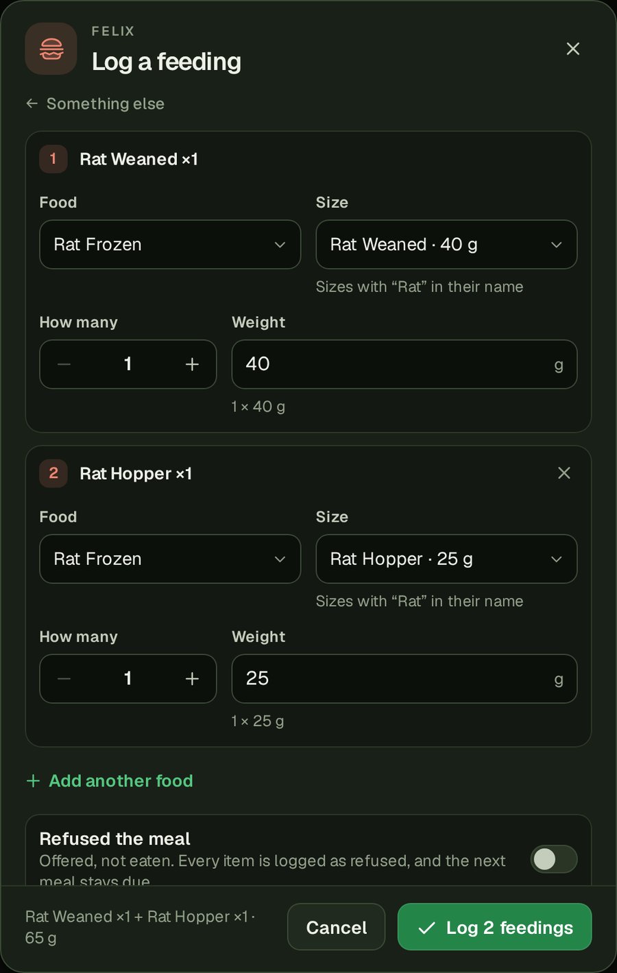
The meal size chart on the dashboard adds up a day's foods against the animal's weight, and the meal shows as one row in the History and the Calendar that opens up to show each food.
Home on Your Phone
This one came straight from my own iPhone. The rows on Home got their bigger pictures back, and the name, ID and weight, and morph each get their own line instead of being squished together. If an animal was offered food but didn't eat, the row now says "tried" so you can tell it apart from one that ate.
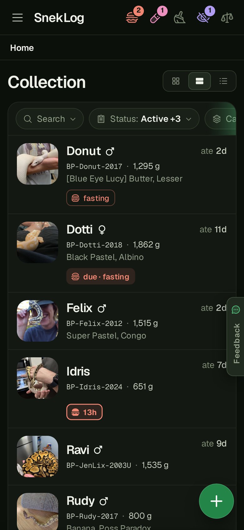
The ♂ and ♀ symbols were showing up as tiny little subscript characters on iPhones, which looked silly. They're proper icons now. I also bumped the text size up a touch across the whole app, desktop included.
Photos Load Faster
Every photo now has a small copy that's used for avatars, rows, tiles and the Photo Gallery, and the full size photo is only loaded when you open it. With a big collection, Home and the Gallery should feel a lot snappier.
Smaller Things
- "Still giving Panacur?" If a repeating medication course is a couple of doses behind, the dashboard asks if you're still giving it, with an "End course" button. It never ends a course on its own, it just asks.
- The Escape key now closes one thing at a time. Closing a dropdown inside a form no longer backs you out of the whole form.
- Dialogs no longer do that little flicker where the page behind them got darker and then a bit brighter.
- Crash reports: if the app crashes in your browser, it now lets me know, so I hear about bugs even when nobody tells me about them.
- Behind the scenes: the check that makes sure the app is still running no longer mistakes a short database hiccup for the whole app being down.
- Announcements can now be put in order, so the important one stays on top.
A Beta Reminder
The beta is still open to existing members only at beta.sneklog.com, and the same rules apply: anything you log in the beta will be reset before the new app goes live. Please keep logging your animals in the current app at app.sneklog.com.
Give the Calendar a spin and use the Feedback tab to tell me what you think.
Cage Cards are still on my list, and so is the new User Guide. Beyond that, your feedback is going to keep deciding a lot of what comes next.
As always, thanks for using SnekLog!
TJ